Brand Notes and Design Thoughts
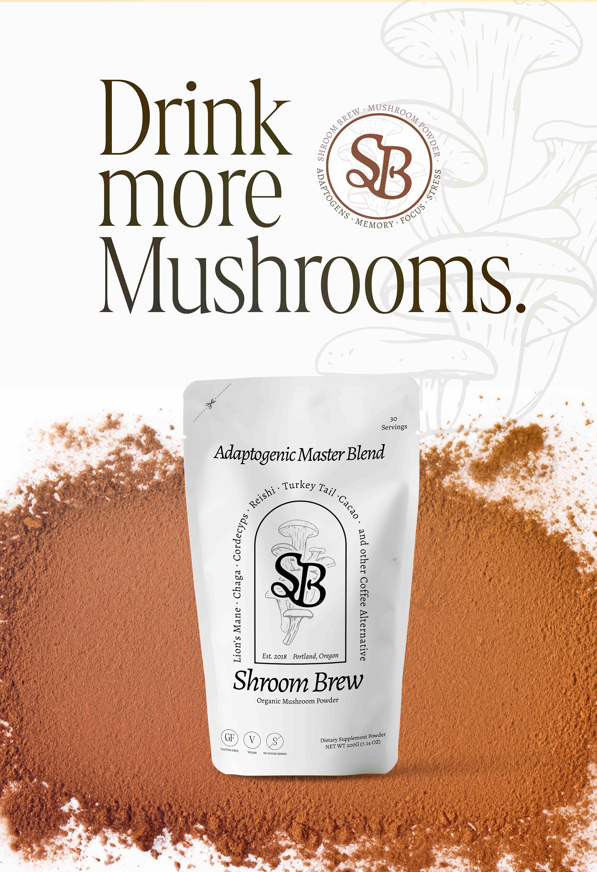
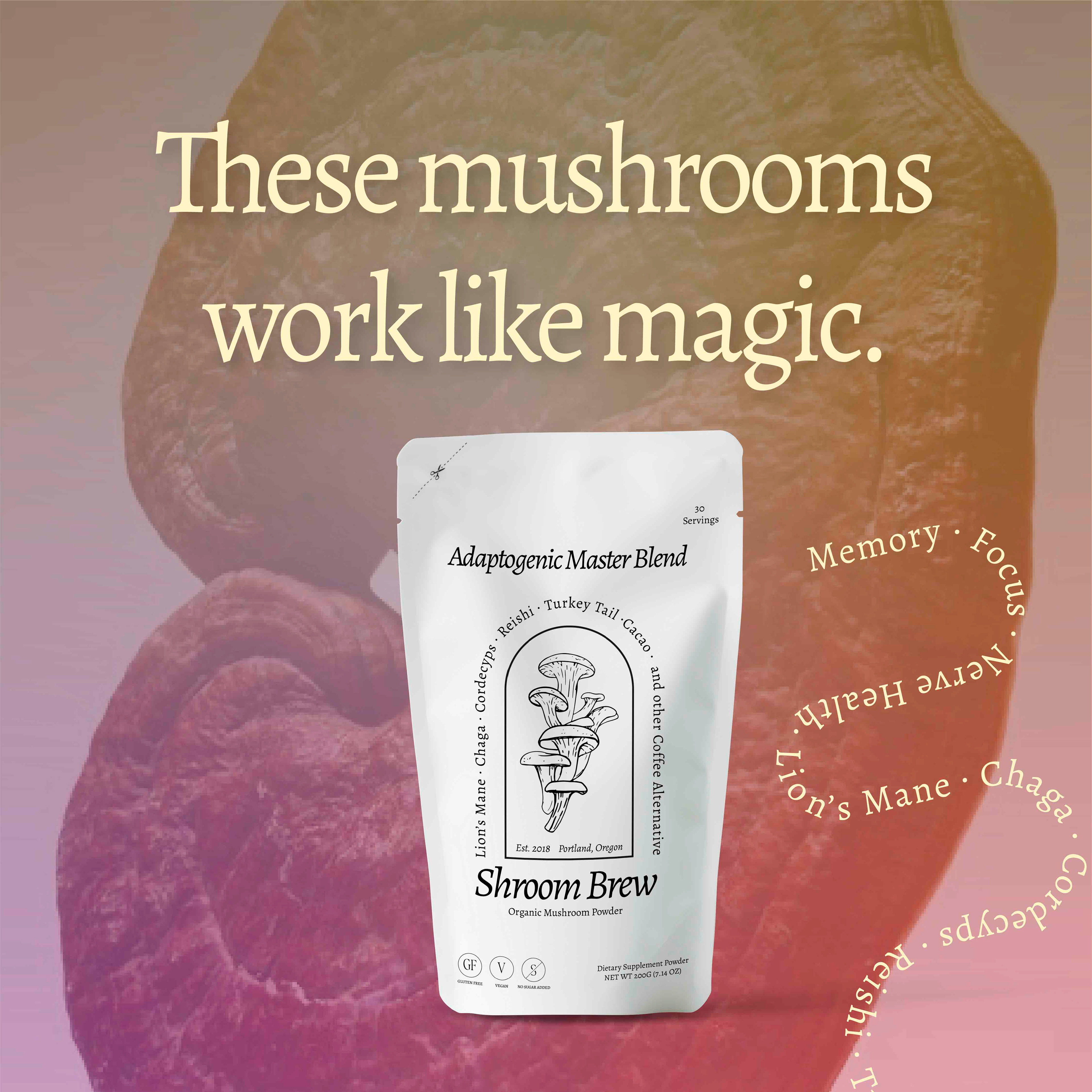
A majority of mushroom powder brands have a retro and or hippie visual style. We swapped that to craft something that felt more bookish, smart and bespoke. Through its visual identity the brand appeals to coffee drinkers or those looking to move away from coffee and start drinking more functional, health conscious beverages.
I hand drew the sprouting mushroom illustration in a pen and ink style to to give it a sense of quality and old fashioned craftsmanship.
The "SB" logo conveys a small mushroom motif inside in the "B" and the cursive connection in the S gives a pen and ink lettering feel, while also conveying the swirl of steam from a freshly brewed cup.
The colors give a cozy, earthy feel, with a balance of masculine and feminine.
Packaging Layout
Backside of Packaging
Moodboard
